There was only one “View Inventory” CTA throughout the whole page.
Audi: Certified Pre-owned
Providing customers a luxurious process of buying a used Audi.
TLDR: I wanted to give customers a premium experience when purchasing their used Audi. My redesign of the Audi Certified Pre-owned landing page allowed customers to make informed purchases and resulted in a 5% higher click through-rate to Audi’s Used Inventory.
My awesome team from Bimm includes Katie Henriques, Project Lead; Reeshni Asokan, UX Designer; and Alexander Cain, Copywriter.


Confusion kills curiosity.
When making a big purchase, say a used $60,000 luxury car, you want to know everything.
Customers have questions and they want them answered fast. Without shopping expectations being immediately met users will leave. Imagine Domino's being ambiguous about their specials and toppings, when you're just trying to munch at 2AM on a Friday night. Cart abandonment would be through the roof.
Designing for a page that lacks narrative.
I wanted to highlight the key concerns and shortfalls of the current CPO Audi page. Using a content audit, heat maps and overlapping user insight, I was able to find 3 main issues.
1. Why should a user click on this CTA?
A key success metric for the CPO page is the click-through rate to Audi’s Used Inventory. Looking at the heatmap of 7,500 visits to the page, 37% of users would click on the "View Inventory" CTA. However, I did not see any incentive nor context for the user to interact with this CTA.

2. Valuable content was hidden at the bottom of the page.
Looking at the heatmap, it was clear that valuable information such as the inspection process, limited warranty, etc. was being overlooked.
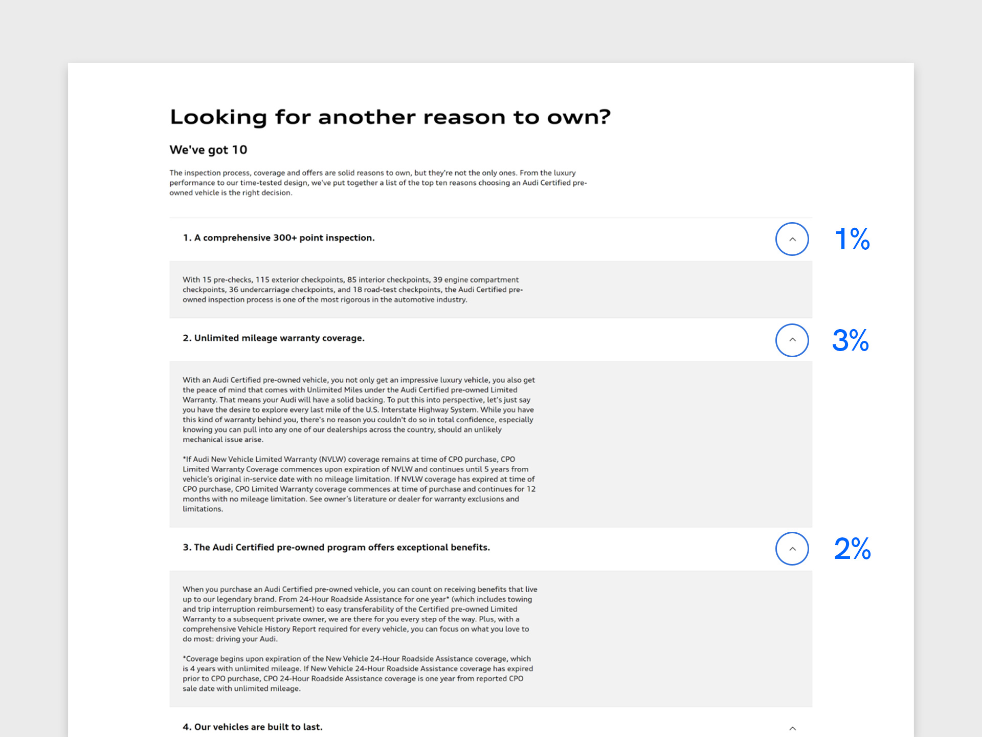
Less than 5% of users would interact with these expandable markers.
3. Surprise! Customers like to see beautiful Audi cars!
I wanted to see if we could leverage user insight from previous Audi redesign projects. Therefore I initiated an internal conversation with our User Researcher.
One sentiment from the conversation was that customers loved large images, videos, and short paragraphs. Lengthy paragraphs were intimidating and unattractive to the customer.

The current page had large bodies of text and insignificant images.
So, How does Audi Compete?
After understanding the shortfalls of Audi’s CPO page, I realized a need to understand the market. By utilizing competitive research of both direct and indirect competitors, I gained inspiration and adopted best practices.
Ironically, I learned the most from an indirect competitor offering a similar service, Apple’s Certified Refurbished program.

Direct competitors such as Mercedes and BMW followed a similar content strategy, however Apple exemplified the architecture in a simple and direct way for customers.
Valuable content strategy.
Looking through multiple competitors,this was a popular and intuitive strategy for users.
1. Program Overview
By providing authentic context and attractive selling points (ex. Warranty, money back guarantee, etc.) customers will trust in the product.
2. Products & Prices
Once the attention of the customer is received, show the products and prices.
3. Additional Resources
Provide additional documents for the wavering customer. These authentic resources provide another layer of security and confidence for the customer.
Let’s start building.
With numerous potential layouts and various ideas in mind, I wanted to put everything on paper.
By collaborating on quick prototypes and having multiple internal discussions with the team, we were able to establish a clear hierarchy.

1. CPO Overview
By prioritizing valuable content (i.e. Audi’s 300 Point Inspection) at the top of the page, trusting the product becomes natural.

2. CPO Vehicles and Special Offers
Customers could immediately see Audi's current offers (i.e. 0.99% financing rate) and vehicles.

3. Additional Resources
To increase buyer’s confidence and authenticity of the product, I added FAQs and links to important documents.
Using heuristics to go to the next level.
This was my favourite part.
After the layout was created, I designed the high-fidelity prototype using a Content Management System (CMS). I used heuristics with my iterations to provide customers a familiar and fun experience.
User Control and Freedom
Customers interact with pages in a hurry and want to navigate content swiftly. Looking within our design system, I added an anchor navigation component to the page to give users more control and the ability to quickly jump between their desired sections.

The anchor navigation cut down scroll time and allowed for users to quickly navigate between sections.
Recognition Rather than Recall
To give customers a familiar shopping experience, I added a carousel with images of the CPO cars and their financing rate. Users could now recognize the similarities between an e-commerce site and the new CPO page.
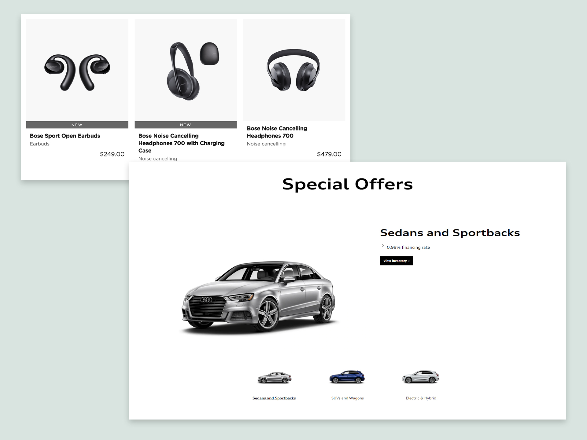
I wanted users to recognize the shopping experiences between online stores (i.e. Bose's product line) and CPO vehicles.
Content trumps UI
Although I liked the UI of the initial Special Offers section, the second iteration was more impactful for the customer. I revised the special offer (2.29% APR) into the headline as important information should not be hidden in the body paragraph.

Customers are able to see the Special Offer at a first glance.
What did I accomplish?
The results of the heatmap (analyzed 7,500 visits) after the redesign was exactly what I was aiming for. View the final design on audiusa.com
1. An increase in a key success metric.
My redesign had a 5% click-through rate increase to the Used Inventory page. In the previous layout only 55% of users would click-through to the Used Inventory page.
2. More users engaged with valuable content.
I wanted customers to read the “benefits” of the CPO program. The total clicks on the accordion increased by 2% (Pre: 6,390 clicks Post: 6,520 clicks).

The heatmap of 7,500 visits showed an increase in page-engagement.
Something I learned.
Accordions. Absolutely. Suck.
One discrepancy I had with the client was the use of accordions/expandable markers. I wanted the benefits of the CPO program to be present and not hidden on the page.
They chose to push for this treatment because they were worried about page length. If I were to design this page again I would remove accordions as they are just another step to access valuable content.
What I would do next time.
Although heat maps provided a way of seeing page engagement, I would have loved to conduct user testing before and after the redesign.
Clicks on a page only tell half the story, I didn’t get to hear our customer’s thought process and opinions. User feedback is always a plus and leads to more empathetic iterations.